My great friend, Joseph Greaser, posted an excellent write up about understanding your audience. Especially when it comes to innovation. You can read all about his case study and data that illustrate this point clearly. Read his post, follow his blog, and then come right back.

The next time you are stuck needing some small talk, here’s a little trivia for you. The average elevation for the state of Arizona is roughly 4,100 feet. Yet that fact covers up a big hole in the data. Actually, one of the biggest holes. The Grand Canyon is also in Arizona. Its elevation bottoms out at only 70 feet in the canyon. Now you’re saying “Of course it glosses over the Grand Canyon. That’s what an average does. It smoothes over the really high peaks and really low valleys.”
So then why do we use the average when trying to understand your customer?
The whole point of understanding your customer is to understand their pain points, their usage, and what innovations they would gain from. But if we keep just looking at average data to “get a feel” for how the whole group is using your prototype, then you could be missing grand canyons of opportunity.
Let’s change the lens for this. Imagine you are a teacher and you are looking at the grades for your students at the end of the year. Half of your class ended with a grade of 100%, the other half ended with a grade of 50%. Would you just average them out and say that your class earned a 75%? You wouldn’t unless you wanted to be looking for a different line of work in the fall. No, you would see two distinct “user-groups” in your classroom. Regardless of grade, both user-groups need your attention.
You would work hard to understand why it wasn’t working for your 50-percenters. You would try new things, different strategies, and observe to identify their pain points. Even your 100-percenters need you. You need to observe them as well to find what is working, try to push them to new territory, and give them some challenges. You would be doing so much to understand your students.
Similarly in innovation, we must journey to the bottom of data canyon to understand our customers.
Let’s look at what the average leads us to. Based on analytics, a website was tracking an average of 5 minutes per session duration. Remembering what we can about averages from freshman year, we imagine the graph to look like this beauty.

Yet, through the magic of mathematics, this graph is also equally likely and just as valid.
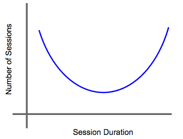
Whoa! Talk about two completely different use cases for this website. Let’s put the graphs together to get the whole picture.

Only in some cases would innovating for the average actually provide some benefit to our customers. There are other valid cases where innovating for the average wouldn’t benefit the customers at all. Talk about wasted time, development, and effort.

Rogers Everett – Based on Rogers, E. (1962) Diffusion of innovations. Free Press, London, NY, USA.
Another great example of this is to look at the Diffusion of Innovations curve. Ignore the extremes for now and look at what aiming for the average would get you. You would be nestled between the Early Majority and the Late Majority of customers. Your innovation would be targeting a user-group that is torn between being scared and skeptical of change. They would be wanting to get something out of your innovation, but at the same time they just don’t want to get left behind.
So what is a good innovator to do? One thing that we are always fond of is looking for micro-patterns instead of macro-solutions. Macro-solutions are the golden bullet, “this will work for everyone” type of product. These have their benefit in some instances but not when you are trying to understand your customers. Remember that averages smooth out the mountains and canyons that customers experience. Macro-solutions need averages to survive.
Micro-patterns help shed light on your customer personas. Go back to the classroom scenario, even though it is simplistic. Just looking at the grade data beyond the average shows us that their are at least two distinct customer personas in the class. It is ok to have multiple personas as long as you understand that they have different needs and desires from your product. The students with 100% grades have different demands from the classroom than the students with 50% grades. Your job as the innovator is to decide which group to innovate for.
The more complex your data is, the more micro-patterns there may be… and this is ok. Complex is neither good nor bad, it just is. As an innovator you aren’t here to judge numbers, you’re here to listen to their stories. And stories can be as deep as the Grand Canyon sometimes, but you have to make the trek to the bottom via mule to truly understand the customers there. Don’t let the shiny averages distract you with their homogenous targets for innovation.
Challenge:
Take a look at some data for your innovation.
- What are some of the shiny, yet deceiving, averages that exist?
- Dive deeper into your data. Are your averages glossing over some of the customer stories?
- Try to identify the different, distinct user-groups for your innovation. List their pain points.
